

Sharing information via PowerPoint presentations is a long-established strategy in higher education. Designing PowerPoint presentations for online courses can pose unique challenges; however, best practices can help overcome these hurdles. With time and attention, faculty and instructional designers can create engaging and purposeful presentations with lasting value.
Overview
The potential pitfalls of PowerPoint are well known. Berk (2012) explains, “too much text and boring graphics top the list of frustrating and uninspiring features” (p. 142). Treating the presentation as a script rather than an outline should be avoided. “Reading text verbatim on a slide off of the screen decreases learning and retention” (p. 143). Audiences of all types become irritated when slides are merely read aloud.
The opportunity to include visual elements such as images, charts, and infographics to augment course materials can substantially elevate teaching and learning. The cognitive theory of multimedia learning (CTML) contends that individuals learn better from content that features both words and images than from content consisting of words alone (Mayer, 2009). Presenters are urged to “use high-quality images and avoid irrelevant graphics or animations” (Garrett, 2016, p. 377).
Guidelines
Use the following guidelines to create PowerPoints that communicate effectively with students:
- Craft slides that share key concepts without excessive text. You can minimize text on slides by moving elaborations to the notes section.
- Use negative space to balance large blocks of text and let students' eyes rest. Without negative space, you risk overwhelming your students and compromising the structure of your ideas.
- If an image is distracting or unrelated to your topic, remove it. Icons and comparative layouts can get your point across as forcefully as images.
- Consider color contrast and other accessibility principles. Is it hard to read the text against the background of the slide?
- Ask viewers to consider, question, examine, analyze, and recreate content.
- Try not to exceed 30 slides per PowerPoint. PowerPoints are best when they are focused on a topic or theme.
Examples
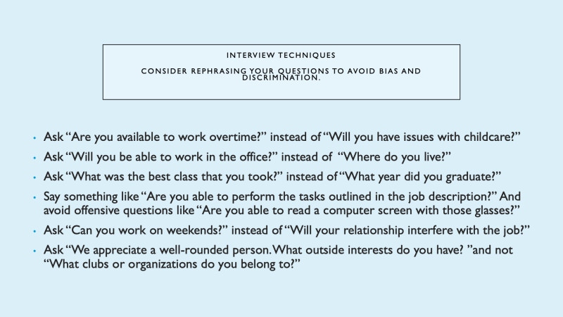
Original Slide 1: This slide is exclusively comprised of text. The title and bullet-point sentences are long and the negative space is minimal.
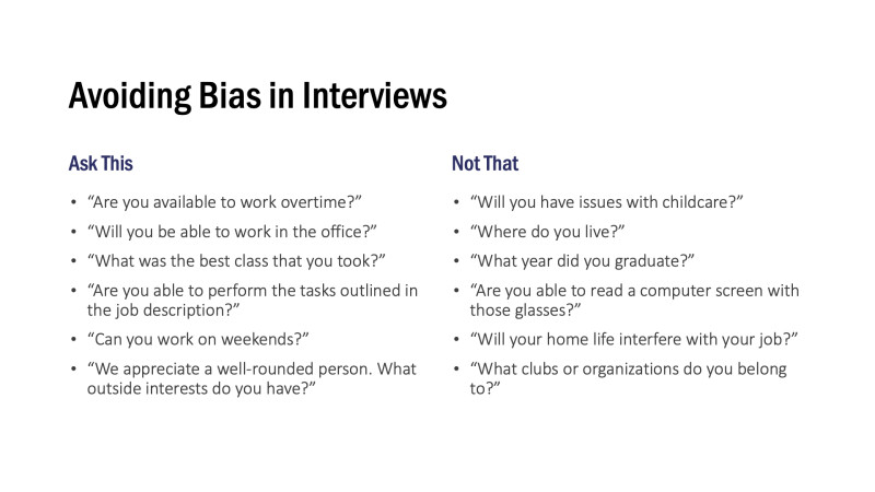
Revised Slide 1: Columns create thematic contrast and separation of ideas. The title is shorter, and there is more negative space.
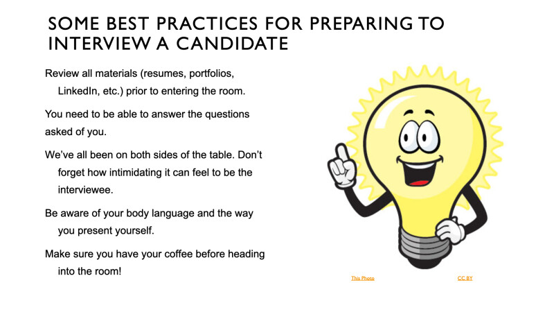
Original Slide 2: It is not clear how the clip art on the right relates to the information on the left. In addition, the yellow citation text does not sufficiently contrast with the background of the slide.
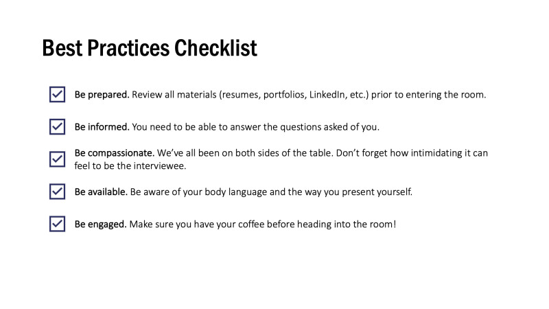
Revised Slide 2: The navy icons are sufficiently contrasted with the white background and reinforce the content on the slide.
References
Berk, R. A. (2012). How to create “Thriller” PowerPoints in the classroom! Innovative Higher Education, 37(2), 141–152.
Garrett, N. (2016). How do academic disciplines use PowerPoint? Innovative Higher Education, 41(5), 365–380.
Mayer, R. E. (2009). Multimedia learning (2nd ed.). Cambridge University Press.