

Some students (older learners, learners with partial sight, learners with colorblindness, and learners using monochrome or text-only displays) have difficulty perceiving color. To ensure that course content is perceivable to all learners, you should follow guidelines for color use that have been established by the World Wide Web Consortium (W3C), the organization responsible for international standards of web accessibility, including the Web Content Accessibility Guidelines (WCAG). Three essential WCAG requirements, known as success criteria, are summarized below.
Guidelines
Avoid using color alone to convey meaning.
Consider the following sentence: The quick brown fox jumped over the lazy dog.
Adjectives are red; nouns are green; verbs are blue; prepositions are orange; and approximately 5-10% of the population won’t be able to follow this grammar lesson.
Let’s try again: The quick brown fox jumped over the lazy dog.
The adjectives are red and bolded; nouns are green and italicized, verbs are blue and underlined; prepositions are orange, bolded and italicized; and nearly every person reading this should now be able to identify each item. (Note: This particular strategy may still exclude users of screen readers, which do not always announce emphasized text in distinct ways.)
Many people are inclined to use color to convey meaning, likely without realizing that they are creating barriers for some members of their audience. After all, color can be a seemingly obvious, and even fun, way to categorize or label items or to provide instructions (e.g., Follow the blue trail markers.). To ensure that all learners can understand your intent, aim to include an additional marker when using color, such as text styling, labels, or symbols, and describe both (or all) markers when speaking or writing about the items in question. You’ve seen this in action wherever you see a hyperlink in a different color and underlined, or an error message in red text accompanied by an exclamation point. If you are discussing a chart with your students, be sure to describe the data points or labels instead of, or in addition to, the colors.
For more information about this accessibility requirement, see Understanding Success Criterion 1.4.1: Use of Color.
Ensure sufficient color contrast between text and its background.
For text to be sufficiently legible to all learners, it must meet the contrast ratio requirements established by the WCAG. The contrast ratio is dependent on the size of the text. For example, “normal” text needs to have a minimum ratio of 4.5:1 in order to be sufficiently perceivable. For large text, which is 14pt and bold or greater than 18pt, the contrast ratio can be lower (3:1). As a general rule, a darker text on a lighter background provides better contrast than the reverse.
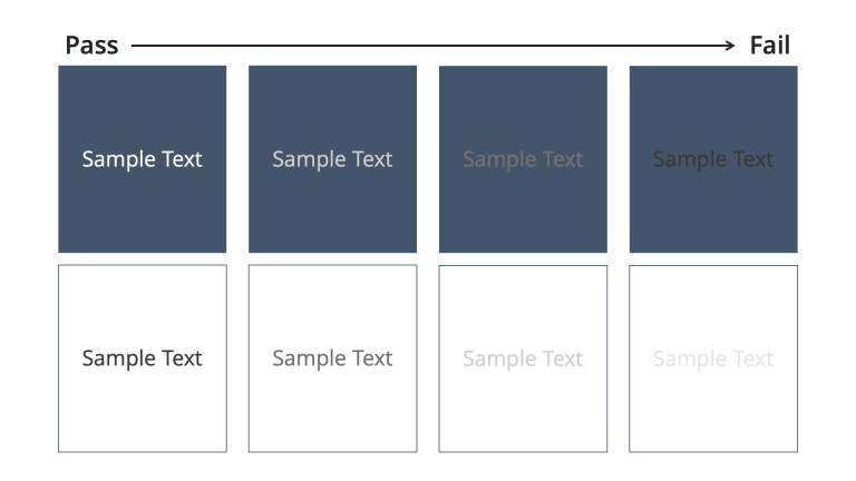
For more information about this accessibility requirement, see Understanding Success Criterion 1.4.3: Contrast (Minimum).
Select color combinations carefully.
Non-text elements, especially when they are informative in nature (e.g., charts), must also have sufficient contrast in comparison to their background as well as any adjacent colors. Additionally, backgrounds with patterns or textures such as gradients may present issues. As a rule, patterns used as a background should be muted or avoided. Bright colors can cause “vibrations,” or an afterimage effect, and should be avoided in large areas, and especially in combination with one another.
For more information about this accessibility requirement, see Understanding Success Criterion 1.4.11: Non-text Contrast.
Additional Resources
Intentional and cautious use of color will not only increase the accessibility of your course materials, but also contribute to a minimalist design that is more pleasing and less distracting to many learners.
For more resources on accessible color use, consult:
- Whocanuse.com is a free tool that analyzes color contrasts and gauges how they would be experienced by individuals with different visual impairments.
- Color Safe allows you to specify a background color, font type and weight. Then the tool produces possible text colors to suit your background.
- The WebAIM Color Contrast Checker performs a quick check of your foreground to background contrast ratio using color hex codes and verifies whether the combination is WCAG-compliant.
- The Color Blindness Simulator allows you to visualize the effect of different kinds of colorblindness on an image.
- Vischeck allows you to upload an image and see how it would appear to users with different color vision impairments.
References
W3C. (2018). Web Content Accessibility Guidelines (WCAG) 2.1. World Wide Web Consortium.